There are two sentences I hear over and over from founders.
“We’re not getting traction in a new market.”
“Our product solves a real problem and it isn’t getting the adoption it deserves.”
Deserves. That stands out to me because it isn’t a metric. It’s what a founder says when they know what they built is good and the market either would argue that, or hasn’t realized it yet.
This week I took apart a homepage that falls into that second camp, and doesn’t deserve to be there.
First, a disclosure
I spent 17 years at PointClickCare. PointClickCare’s logo is on Swift Medical’s homepage, and years ago I sat in demos when Swift was being integrated into the platform for wound care.
I remember two things about those demos. I was grossed out by the word “tunnelling.” And I thought the software was remarkable.
That hasn’t changed. This is a great product from a great company in my own backyard, and nothing below is about the technology.
There’s no ‘you’ on the page
Swift’s homepage runs about 326 words. The word “you” appears zero times.
Not “you” as in casual. “You” as in the reader. In 326 words about wound care software, the person reading is never once addressed.
You can check this on your own site in ten seconds. Ctrl+F, type “you,” look at the number.
Most B2B pages I audit land somewhere between four and fifteen. Zero is rare, and it’s usually a sign that the page was written to describe the product rather than to reach anybody.
Six audiences named, six audiences unaddressed
Further down, Swift lists six settings they serve. Home health agencies. Clinical trials. Mobile providers. Hospitals. Wound care clinics. Skilled nursing facilities.
That’s considerable reach, and it’s more than most companies in this category will commit to.
Each card is an icon, a label, and a link. Not one of them carries a sentence or a reason to read more.
“Skilled Nursing Facilities” selects nobody. Every skilled nursing facility is a skilled nursing facility. It’s a category, not a person, and it tells a director of nursing nothing about whether this software was built with her building in mind.
Swift can do better here, because they already have. Their own skilled nursing page leads with clinically validated touch-less wound measurement and standardized documentation. “Touch-less” is arguably the best word on the entire site.
It’s on page two, behind an icon.
Nobody shops on a normal Tuesday for wound care software
Here’s how a director of nursing ends up looking for wound care software.
A surveyor walked the building. Something got written up. Now there’s a corrective action plan with her name on it, and a conversation with the administrator she’d rather not have again.
That’s the week she searches. Not because she was evaluating vendors, but because something happened.
The words citation, survey, and deficiency do not appear anywhere on Swift’s homepage.
The page is written for a calm, rational buyer conducting an orderly evaluation. That buyer only exists in a marketing plan. The one who actually shows up is having a bad month, is stressed out, under pressure, and desperately looking for help.
32 million pictures, no people
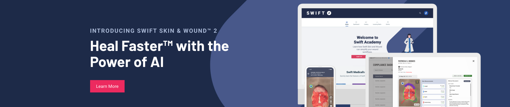
Swift’s software measures wounds from a photograph. Pressure ulcers, mostly. Their counter says 32 million images.
There isn’t a photograph of a person anywhere on their homepage.
No nurse. No resident. No room, no bed, no hallway. Every image is a picture of the software. Phones, tablets, laptops, dashboards, line icons.
The only human element on the page is an example wound inside a measurement grid.
Wound care is physical work. Someone turns a resident every two hours. Someone kneels on the floor with a camera. Someone explains to a daughter what stage three means. Someone has been doing this for 22 years and can tell by smell before she pulls the dressing.
None of them are on that page.
I understand how this happens. Device shots are safe. Nobody has to get a facility to sign off, or chase consent, or sit in a meeting about whether an image of a resident reads as exploitative. Picking the tablet over the nurse is the careful choice, and it’s defensible every single time.
But there’s a cost.
The best thing they own is something you can’t see
Swift has published peer-reviewed research on whether wound assessment reads accurately across different skin tones.
That’s a real clinical challenge. It affects patients. It’s not a question many companies in this space are asking out loud, and it’s probably the most valuable thing Swift can say about their software.
They studied whether their photographs work on everybody’s skin. Their homepage doesn’t say it or show it.
The research isn’t on the homepage at all. It’s on the Learn page, listed as a paper title. The summaries on that page are poster images you can’t open, and they don’t link out to the actual studies.
So the reader who takes Swift seriously enough to check the evidence is the one who hits a wall. Nobody clicks a citation unless they’re already interested. That reader was going to be the internal champion, and the page turns her into someone with a question she can’t answer.
Nobody was directing the whole story
Look at where everything ended up.
The homepage has the software. The Learn page has the research. The skilled nursing page has the best word.
Each of those pages is fine on its own. Somebody wrote each one, and each one probably passed review.
What none of them have is a person. The software page shows devices. The research page shows a paper title. The word “touch-less” describes a hand not pressing on a wound, which is the most human thing on the entire site, and it’s sitting alone on page two.
Every piece is about people. Not one of the pages says so.
Nobody looked at all three together and saw how much bigger the sum was than the parts.
That’s the actual failure, and it’s why “fix the homepage” is the wrong prescription. You can rewrite that page tomorrow and the research will still be filed under Learn, the best word will still be on page two, and the next asset anybody produces will drift again. There’s no shared story for it to drift from.
What this looks like from inside the jar
If you’re at a company like Swift, the day-to-day version of this problem is quiet.
Your website says one thing. Your deck says something close but not identical. Two of your reps have built their own pitch because the official one didn’t land and nobody owns updating the main narrative. A customer describes what you do better than any of your material does, and that quote lives in one case study nobody reads.
Every one of those pieces is defensible. Together they mean a buyer hears a different company depending on where they meet you.
That’s what “not getting the adoption it deserves” usually is. The product is fine. The market is hearing different, sometimes conflicting versions of it.
Try this on your own site
Three checks, maybe ten minutes of your time total.
Count the instances of “you” on your homepage. Write the number down.
Find the sentence that names who the page is for. If the closest thing is a job title or an industry label, you don’t have one.
Then open the best thing your company has ever published and see how many clicks it takes to reach from the homepage.
That third one is the question I’d ask if I could only ask one. What’s the best thing your company has published that isn’t on your homepage?
Most people can answer that pretty quickly. And that’s the issue.